Mario has been influential in the 3D platformer genre ever since Mario 64 invented it. Even while most other companies had abandoned 3D platforming, Nintendo stuck with it with Galaxy and 3D Land/World. With the success of Mario Odyssey, we can only hope that Mario has helped revived the genre as well.
It’s been fascinating to observe how Nintendo has evolved the level design throughout the series. Let’s discuss this starting from the beginning. In this post, I’m going to focus specifically on level layout and challenge layout. Level layout is the way the world Mario explores is structured physically, while challenge layout shows us the nature of going from one challenge to the next.
Mario 64/Sunshine
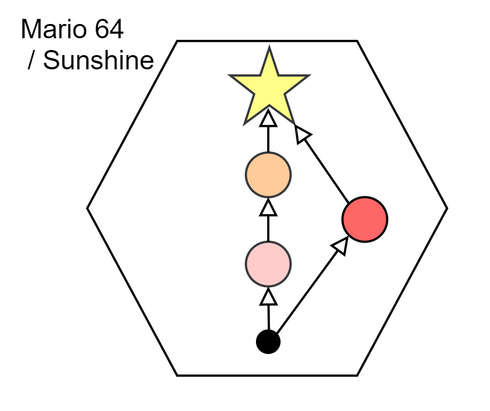
For Mario 64 and Sunshine, the player chooses a goal to obtain when they enter a world. Once they’re in the world, in most cases, they have a single goal (a Power Star) they are trying to find in the level. It’s up to them to navigate the expansive level to claim their prize!
For the sake of convenience, I’m calling the act of getting a single star a “level” in the game. While you can enter the same world multiple times to get different stars, you can imagine each is a separate level (a set of challenges in an environment you have to overcome to obtain a goal). The following diagram shows the high-level level design:

Different levels within a world reuse the same sandbox but change the goal you’re after. A single level has the following properties:
- Level Layout: Sandbox – as shown by the large hexagon in the diagram. Players explore a vast world and have to figure out how to obtain the star.
- Challenge Layout: Decide your path of somewhat random challenges to a single goal.
What’s great about this?
- EXPLORATION!!! A vast world to explore in whatever way you want!
- You have multiple ways to reach your goal. Multiple paths add layers of challenge so that high-skilled players can find different ways to play the game and stay in flow. This is why speed running has been so popular with Mario 64.
Sunshine did little to alter the level design from Mario 64. The main addition is related to jump mechanics to help 3D navigation (a lot like the feathery flap in Banjo Kazooie). While it’s exciting, I’ll save mechanic evolution for another post.
Mario Galaxy
By the time the mid-2000s came around, 3D platformers were dying. While there are several reasons, the fact that you must have a certain level of skill to navigate the world and find your goal, limiting the number of players that can enjoy the game, was indeed a contributor.
Even with the introduced jumping mechanics, Sunshine’s skill floor was still higher than 2D platformers due to the nature of 3D space and expansive environments. Nintendo wanted an accessible game anyone could play, but would still be hard to master. The answer was Mario Galaxy.
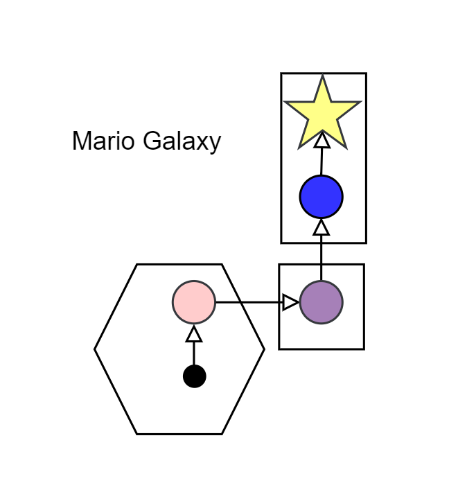
To lower the skill floor/decrease the barrier to entry, Nintendo recognized some of the usability problems related to exploration, so they created smaller worlds that were more linear. Here’s a diagram:

A level might have one small sandbox (the hexagon) and then transport you to small “moons” (the squares) that would effectively be little balls of challenge and eventually you would reach the star at the end.
- Level Layout: Small stages (Squares) that would transport you to another challenge after completing some challenge. A few sandboxy environments (smaller than 64).
- Challenge Layout: A linear series of random challenges that lead to a single goal (per entrance to the world).
What do we notice:
- The different stages in a level allow for game developers to create discrete challenges separate from each other. Separate stages allow some to be exploration oriented while others platforming focused. The platforming sections tend to have a camera that is more manageable (locked in a position).
- We lost the layers of challenge from multiple choice that Mario 64 had. Now, any challenge layering was purely in making Mario move faster through the world in more daring situations.
- We don’t have as much to explore. There’s less meaningful exploration, too. For example, the red/blue coins from 64/Sunshine are gone. Now, all there is to find are star bits and coins, consumable collectibles that you can grind for anyway.
- The spherical nature of the levels could be hard to navigate for low-skilled players. It’s an odd choice when the rest of the decisions in the game design seemed to be made to make the game more accessible (fewer jumping mechanics, linear challenges, smaller levels, less confusing hub world). My only guess is they wanted to use the gimmick of gravity and space to sell the game (worked for me!). The concept of moons/planets does allow for a natural way of switching between stages, though.
To put my opinion out there, I prefer Mario Galaxy to the rest of the series (except possibly Odyssey). I love it mostly because linear challenges don’t bother me, some worlds are big enough to explore (even if there’s not much to find), and the cinematic experience is grand with the gravity bending gameplay situations leaving the game memorable for me.
Nevertheless, I find Galaxy to have the worst level design of all 3D Marios (at least at a high-level analysis). It struggles being in the middle of an exploration-based 3D platformer and a challenge-based 3D platformer without doing either side the justice they need. While it suits me, the jack-of-all-trades nature makes it hard to accommodate a wide-range of players.
Man, it hurts being so negative on one of my favorite games of all time 🙁 Many of its flaws wouldn’t be realized until future games made it glaringly obvious. But, we’ll continue that while talking about Galaxy 2 and 3D World Next time next time 🙂 (PS – Galaxy still has several great things about it and shines strong such as its core mechanics.)
Please sent all ads and promo information by E-mail:muz@alfaradio.by
шланг гибкий пищевой
From many manuscripts of Antiquity
ancient and medieval Latin,
handwritten books were made,
new texts were rewritten
(palimpsests). In the XIII-XV centuries in
Century to a kind of destruction: