In part 1, we discussed how 3D Marios were gradually becoming more player-friendly to grab a broader audience in 3D platformers. Mario Galaxy started the trend of more linear levels to prevent players from being confused with exploring 3D space. However, these levels were often a hodgepodge of random ideas with few challenges for players of different skill levels. What would Nintendo do to make the game better for both low-skilled players and high-skilled players?
Mario Galaxy 2
Mario Galaxy 2 saw the introduction of the 4-part structure into the 3D Marios. Four-part structure in level design gradually evolves a single mechanic to create focused levels that teach players as they go.
- introduce a mechanic
- develop it
- give it an unexpected twist
- bring it to a conclusion
Let’s see how this applies to Mario Galaxy 2:
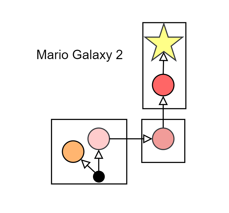
- Level Layout: Small stages (Squares) that would transport you to another challenge after completing some challenge. Stages progress linearly.
- Challenge Layout:
- Light use of linear four-part structure to teach mechanics and challenge you towards the main goal of the level (as shown by the gradually darkening color).
- An optional comet medal in each level (as shown by the orange circle leading to nowhere).
What do we notice:
- Four-part structure made levels focused and more natural to play by gradually increasing difficulty of the same mechanic.
- Comet medals add a much-needed reason to explore and challenge layering to give something optional for high-skilled players.
- Levels got smaller and more streamlined, upsetting players that wanted more exploration-based 3D platforming.
Mario 3D Land/World
Even with the new structure of Galaxy 2, the sales continued to be less than those of 2D platformers, which I attribute to the nature of the difficulty in playing 3D platformers. Since the Galaxy series had higher production costs, it’s only natural for Nintendo to wonder how to make 3D platformers more accessible.
Nintendo had established such a good rhythm in 2D Marios that sold extraordinarily and were hoping they could convert this to 3D. I imagine someone at Nintendo said: “If New Super Mario Bros is so much more successful than Galaxy, why not just make the same game in 3D and call it good?” The result was 3D Land and 3D World.
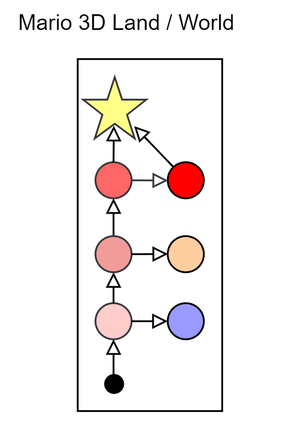
- Level Layout: Small, linear, timed levels with a flagpole at the end that will allow you to reach the next level (like 2D Marios, but with a third dimension).
- Challenge Layout:
- Use of four-part structure to teach mechanics and challenge you along the linear path of the level (as shown by the gradually darkening color).
- There are three optional coins/green stars in each level (as shown by the circles that don’t lead to the star). 3D World adds a stamp to collect in each level, too.
- The end of a level has a bonus challenge: reach the top of the flagpole. If you miss, you still complete the level. The flagpole challenge is the optional conclusion of the four-part structure – a challenge that proves that you really mastered the mechanic. The flagpole is represented by the dark red circle in the diagram.
What do we notice:
- Borrowing the structure of New Super Mario Bros added a strong sense of challenge layering in the form of three optional coins to find in each level helping more skilled players stay engrossed in the game. The bonus flagpole goal in each level is also great challenge layering, usually for those that really want to prove they’ve mastered the mechanic in the level.
- By 3D World, the four-part structure was perfected. There’s a great Game Maker’s Toolkit video about this.
- 3D World’s levels were structured for multiple players at the same time with several optional challenges (usually coins or powerups) for players to collect and compete against each other.
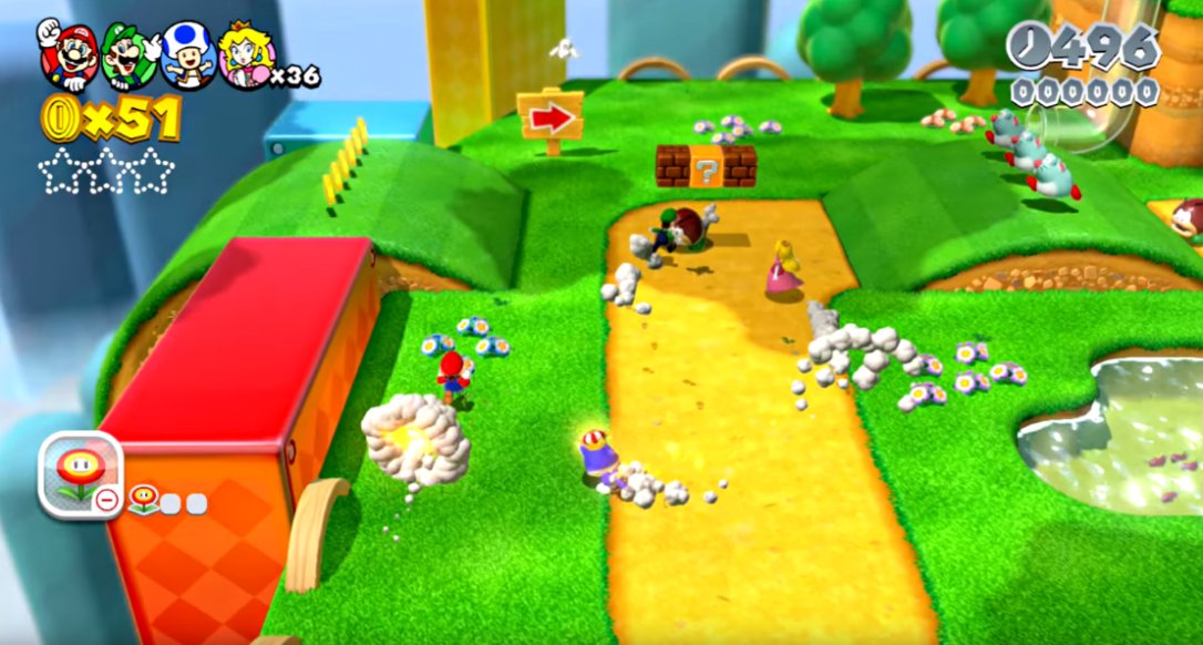
Even with Mario 3D World’s robust game design, the camera angle and distance reduced the sense of scale and cinematics from previous 3D Marios. The small sense of scale impacted the enjoyment of the game for players looking for that classic 3D platformer feel (so much so that I never completed it). (I still love 3D Land. It’s a must play if you have a 3DS.)
It’s only natural that when faced with the task of making a new Mario for the Switch they would take what they learned in the past twenty years and try to make a cinematic, exploration-based 3D platformer with a sense of scale that still had excellent game design. The result was the outstanding Mario Odyssey, and we’ll examine it in part 3.
So cool!