Xenoblade Chronicles 2 is an insanely complicated game. The excellent battle mechanics is just one example of how complex this game is. With all this complexity, surely there are things we can learn about how to teach players mechanics in games. Let’s explore how Xenoblade 2 teaches players and how it could be better.
Self-Evidence
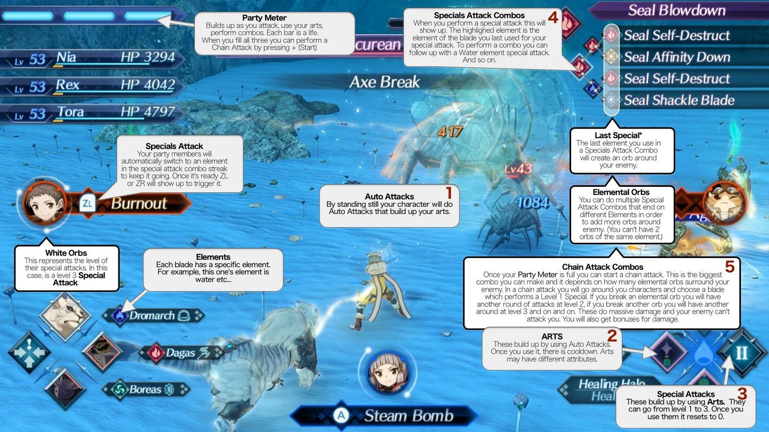
The incredible book on user experience, Don’t Make Me Think, suggests that the best user interfaces are self-evident – someone can look at the user interface and know what everything means and what they can do. Applying this to games: a game shouldn’t need to teach the player at all because the UX should be self-evident. RPGs typically have a problem with this due to the complexity of the mechanics. Xenoblade 2 is no exception. Just look at the battle UI (credit to Reddit user jp21231 for the image):

Let’s point out some good things:
- The specials attack points out the button you must press. ZL and ZR are also on the left hand and right-hand side of the screen respectively, corresponding to the hands you need to use. This makes it easy to remember which one to press.
- The bottom left and right sections correspond to the DPAD and xyab respectively. Somewhat experienced players will quickly be able to recognize that these buttons map to the things on the screen.
- The names of the arts and what they do next to the arts are incredibly useful mid-battle. Although, it’s easy to accidentally turn them off (left stick click) and not realize how to turn them on.
- Elemental colors and shapes make it easy for people to see exactly what the need to perform combos. (Still, the special attack prompts could have the elemental symbols to help color blind people.)
Some things that could be improved (although some may be difficult):
- The Party Meter in the upper left corner activates when you press +. There’s no indication that you can press + to do anything here. Additionally, + is on the right Joycon. This violates the rest of the UI design that keeps your hands tied to their half of the screen.
- There’s typically a flood of numbers. It’s way too much information to display to the player at once. Even with the color coding, I found myself just ignoring the numbers unless it’s a critical hit because there’s too many to pay attention to. This can make it difficult for the player to learn which strategies in battle lead to the best damage outcome.
- The specials combo in the upper right corner. When I first saw this, it made no sense to me. It would make more sense by adding arrows between levels (the lines in the above pic between elements aren’t actually in the game, but this is an example of what would make it more apparent). Additionally, there’s no way to know the elemental combo trees in the game besides memorization.
- While there’s a nifty control popup you can call on the screen to see controls. Unfortunately, there’s no way to view the battle controls during a battle. As far as I can tell, there’s no reason they didn’t supply an in-game pause screen in battle. The pause screen would’ve been an excellent opportunity to show the controls and elemental combo trees.
While I won’t go into it too much, the menu UI leaves a lot to be desired. I was always pressing the wrong button to get to the map vs. changing time vs. the normal menu. The normal menu is also extremely complicated with as many different systems that exist in the game. This makes it more difficult to learn the progression mechanics than it could be.
Tutorials

The majority of mechanics rely on tutorial boxes to teach mechanics to the player. This tends to have many problems:
- Tutorials overwhelm players with information with more information than they need at that point in the game.
- Tutorials can never be referenced again in the game. An in-game tutorial list would be very helpful. I had to resort to the internet to learn about the controls and mechanics.
- Tutorials tend to do things for you (such press buttons or fill up gauges for you automatically). Tutorials should always force the player to perform what they are trying to teach to help the player grasp the concept. I shouldn’t be walking away from a tutorial not understanding what it was trying to teach me.
- Tutorials nag the player during critical plot bosses. In every boss in the first third of the game, you have to pause to read tutorial boxes. Usually, you just wanna whoop some butt, but no, you gotta wait and read this confusing text.
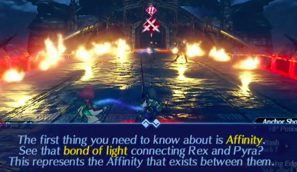
- The first boss with a blade was too early to learn about blade combos. It was already overwhelming information for most people, then teaching you this mechanic (when you can’t even use it without the game doing it for you) is extremely confusing.
Most importantly, the game teaches players without making sure they actually learned it! Games should strive to show the player how to do something and then require them to do it before moving on. This makes it stick in their head. Tutorial enemies that block the player’s progression for not understanding mechanics would’ve gone a long way in helping players understand mechanics.
Other thoughts
The ultimate sin is the game never telling you how rare Overdrive Protocols are. In my playthrough, I found three throughout the 60 hours I played. I wasted the first one wondering what it did (it’s very unclear in the menu). I wasted the second one because I needed an extra fire blade on Rex to use a field skill (because I wasn’t lucky enough to get one for him naturally), so I used one. It was only later that I realized how rare this was. The game should warn players about this.
It’s unclear what affects your luck of getting Rare blades. With as horrific as the randomization is, you would at least want to know how you can maximize your chances.
Ending on a positive note: I love the helpful NPCs in the game that remind you of mechanics. While it could be done more often, I appreciate this. It helped me realize “Oh, this Break, Topple, Launch, Smash sounds important. I should try it out.”