In Ratchet and Clank: Going Commando, automatic weapon upgrades were introduced to the series. Weapons would gain experience as they are used to defeat enemies. When they have enough experience, they upgrade to a completely new weapon, which is better than the original in every way in most cases (except the lava gun).
Weapon leveling is revolutionary. Every game in the series would retain this mechanic in some form or another. What makes it so great?
- It lets players see and feel progression – dramatically too, because the weapons change form completely, in a juicy quick scene, and then function more effectively.
- It gives players more to achieve in the game, making them play longer.
- Challenge layering – Low and high skilled players will use weapons that keep them in flow.
Let’s talk about challenge layering a bit more. In this case, higher skilled players are encouraged to play with different weapons to level them up. Efficient leveling requires using weapons that aren’t upgraded, which tends to be weapons the player has less experience with or finds less useful. Since a player uses a less appropriate weapon for a situation, combat is risky. Now the player is more in danger. These are players who may get bored if they weren’t encouraged to change weapons, so they end up being more engaged in the game.
Meanwhile, if a player is struggling, they can always switch to a weapon they’re better with and turn the tides to their favor, preventing frustration. It keeps the player nicely inside their personal flow zone.
User Interface
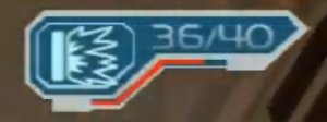
How is it displayed to the user? When using a weapon, you can quickly see how close it is to the next level. (It’s somewhat hard to figure out how soon this is, though.)
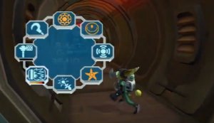
 Well, that’s nice! But what about when switching weapons? We know how important the weapon progression information is to player’s making informed decisions. To make it an interesting decision, the player must be able to see this information when they need it. Here’s what Insomniac did:

They show the progress towards the next level under the icon and upgraded weapons turn orange. This is great UX design:
- The user can quickly see upgraded weapons because color is used to differentiate weapons. This is useful if they need a reliable weapon now or if they want a weapon that they can try to level up.
- Players can easily see how much progress they have towards an upgrade by looking at the bar underneath the weapon, so they can make a more informed decision.
- Even though color is used to distinguish weapons, these colors are color-blind friendly.
Conclusion
Weapon upgrades from Ratchet and Clank: Going Commando enables the player to make an interesting decision: choose between a weapon they are trying to level up or a weapon they have confidence in. The decision lets players play riskier while being able to fall back to a more reliable approach if needed. To top it off, the UI allows the player to see the information they need at a glance so players can focus on deciding rather than finding information. How could you use a mechanic like this?